
How to Create the Dreamiest Designer Gallery Walls (Without Breaking the Bank)
- Jan 23, 2019
- 5 min read
Updated: Oct 1, 2020
Gallery walls are awesome. Period. Whatever style you choose, there's always a way to play up an empty wall and really pull a room together with what you choose to display on them. You can think of it akin to accessorising an OOTD - a carefully-considered touch ultimately elevates the level of sophistication. But I get it - styling a wall can be a tad intimidating (or maybe even the thought of boring a hole unto the wall would be enough to cause a panic attack), but it doesn't have to be! It's all about knowing what you want, planning with care, and helping yourself to a bit of DIY, and you're well on your way in creating the curated gallery wall of your dreams.
So, without further ado, here's a round up of my 4 absolute favourite designer gallery wall styles, along with some practical designer tips on how you yourself can achieve them. I've also included links to local online retailers carrying art posters, picture frames, and wall decors to get you started. Believe me, they're actually simpler (and more budget-friendly) than you think.
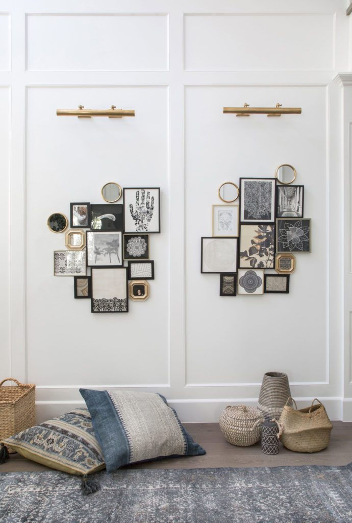
THE OFFSET

Styling by Emma Fischer 📷 Allen Cordic for @bjurforshome
If you had to fill a wall over a sofa, the most common approach would be to create gallery right in the middle. And while that's usually pretty great too, I love what offsetting does, which is to introduce negative space. That visual "tension" creates a more interesting flow and movement within the room - like a confident, rebellious streak that just makes it all the more mysterious and alluring.
It's also just a fantastic way to create an intimate tableau with smaller furniture pieces and/or decor in the room, like the design shown here. The trick is to figure in what your focal point would be - let's assume the biggest or most eye-catching artprint from the collection - and have the rest "dance" around it. You can work out the placement on the floor first or trace the frames on manila paper, cut, then set it up for a mock-up, taking into account the spacing in between (anywhere from 2" to 4" / 5 to 10 cm). Pro tip: line up the edges of your focal art piece with some of the smaller pieces to form internal grids, and from there radiate out the remaining items for a more eclectic, perfect-imperfect look. And don't forget to integrate furniture or decor (with its height and width) in this vignette by leaving enough space for it to shine - think of it as though you're looking at a 2D version of the elements along the axis of the wall. And viola! Curated wall perfection!
THE GRAPHIC ONE-DER

Design by @bhdmdesign for @theamberlybk
In need of a graphic edge on a long and tired bedroom wall? Why not try creating a gallery filled with some classic black and white prints! The beauty of this particular style is that you don't even have to vary the size of your frames. Stick to one size (in this case a 10 cm x 15 cm frame from Ikea), scale and print a black and while image/photo, or in this case, a stencil of choice (I quite like the idea of having silhouette stencil of birds in flight, just to further emphasise the illusion of movement), and arrange it in such a manner where the frames cluster at the center, then gradually spread them outwards. You can definitely take certain liberties with the orientation and spacing in between the frames. Strength is in numbers here, so for a full graphic impact I suggest a minimum of about 10 frames. High-impact drama without the actual drama!
THE ECLECTIC COLLAGE
Design by @laurauinteriordesign
Confession: my love for all things eclectic has never really waned, in spite of the growing minimalist trend sweeping the design world. If anything, I love when there's good, playful balance of these two worlds, because then it just goes to show that design is adaptable, and is never be about following trends for the sake of it. I'm big on following your heart's desire, and adding elements of fun and creativity always, so gallery walls like these make my heart go pitter-patter.
There are "pre-made" versions of a collage gallery available in the market, but to be honest, they look too cookie-cutter and lacking in personality. First step in creating your own eclectic collage composition is to pick out a theme, mood or a colour palette that speaks to you. There are many selections of framed posters in various sizes available online, so that part alone can get a bit overwhelming. My general rule of thumb for a well-balanced mix would be to do a ratio of 60% (A4/A5/30x30 cm prints/decor) - 40% (small frame, decors, and mirrors of nearly same size), or vice versa. You can mix them all together in various shapes, textures, and finishes as well. If you're up for a bit of treasure hunt, try and find some vintage pieces for a cool and unique twist!
When laying it out for the first time (the floor is your best friend), treat the composition as one big and compact artwork, and move the pieces around until you're satisfied with how it looks before hanging them on the wall. Collage compositions like these are perfect for hallways or awkward corner walls you've been stumped for awhile now to fill, or just want a something a little more out of the ordinary. God knows we were never meant to be #basic!
PICTURE LEDGE EDGE

The Loft by @theplayingcircle
While there's a seeming ubiquity of picture ledges in Scandinavian-inspired interiors, they really are the unsung heroes of uncomplicated and hassle-free gallery walls. But if you're going to go for it, might as well make it exciting! Add, edit, and layer posters, frames, and decor to your heart's content, while varying theirs heights and placements. Adding texture and interest with decorative objects go a long way here, so don't be afraid of a little experimentation. Pro-tip: To make everything feel cohesive, yet deliciously random, maybe almost stream-of-consciousness, try and create a visual storyboard based on a theme or mood, and be consistent with your colour palette and textures throughout. But to be perfectly honest, there is no right or wrong way, and I love that about creating gallery walls on picture ledges - endlessly versatile, and oh-so very chic.
What do you think of my top picks of gallery walls? Did any of these tickle your fancy, or maybe you too have been meaning to try a particular gallery wall style, but don't know where to begin? Leave your comments below, or email me for inquiries on more expert design advice - you're more than welcome to do so :)
Comments